
Three Seconds of Attention: How We Test Kai with Predictive Eye Tracking
The people who use Kai are busy. A share in an aircraft or a yacht usually belongs to someone who runs a company, and they look at our landing page between two meetings with one question: does this make the admin go away. They decide with their eyes in the first few seconds. We wanted to know what those seconds actually contain, and we did not want to guess.
This is a look behind the scenes at how we did it, because the tools are worth knowing about and the results were not what we expected.
The problem with asking
The honest way to find out what people see is to watch them. That is slow, expensive, and hard with an audience like ours; you cannot recruit twelve fractional aircraft owners for a Tuesday afternoon. An A/B test is the other honest way, but a split test needs traffic to reach a conclusion, and a niche product does not have enough of it to learn anything inside a quarter.
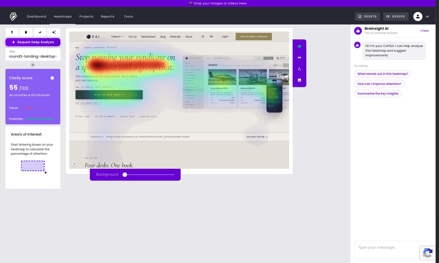
So we used a third option. Predictive attention models are trained on real eye-tracking data and estimate, from a single screenshot, where people will look in the first seconds. We used Brainsight, a Dutch platform built for exactly this. You upload a screenshot and it returns a heatmap, a gazeplot with the predicted order of fixations, and a Clarity Score for how easily the design is processed in the first glance.
The first round
We captured eight screenshots: the landing page and the demo dashboard, above the fold and full page, on desktop and on a phone. Our landing page hero, which we had rebuilt over the summer and were quite proud of, scored 8 out of 100.
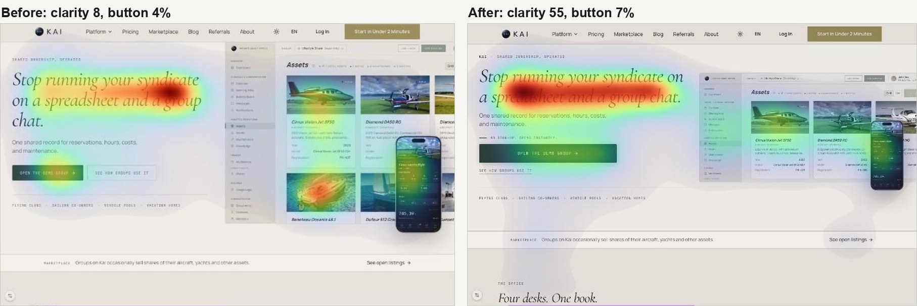
Attention split into two islands: the headline on the left, and the product screenshot on the right with its photographs of aircraft and yachts. The button in between, the one that opens the demo group, got four percent. The predicted first fixation was not the headline at all. It was the pictures of the planes.
The dashboard had its own surprise. The single hottest element was the greeting, "Welcome back". The buttons for logging usage and making a booking, the two things a member most often opens the app to do, got nothing. On the phone the most looked-at element was the UTC clock.
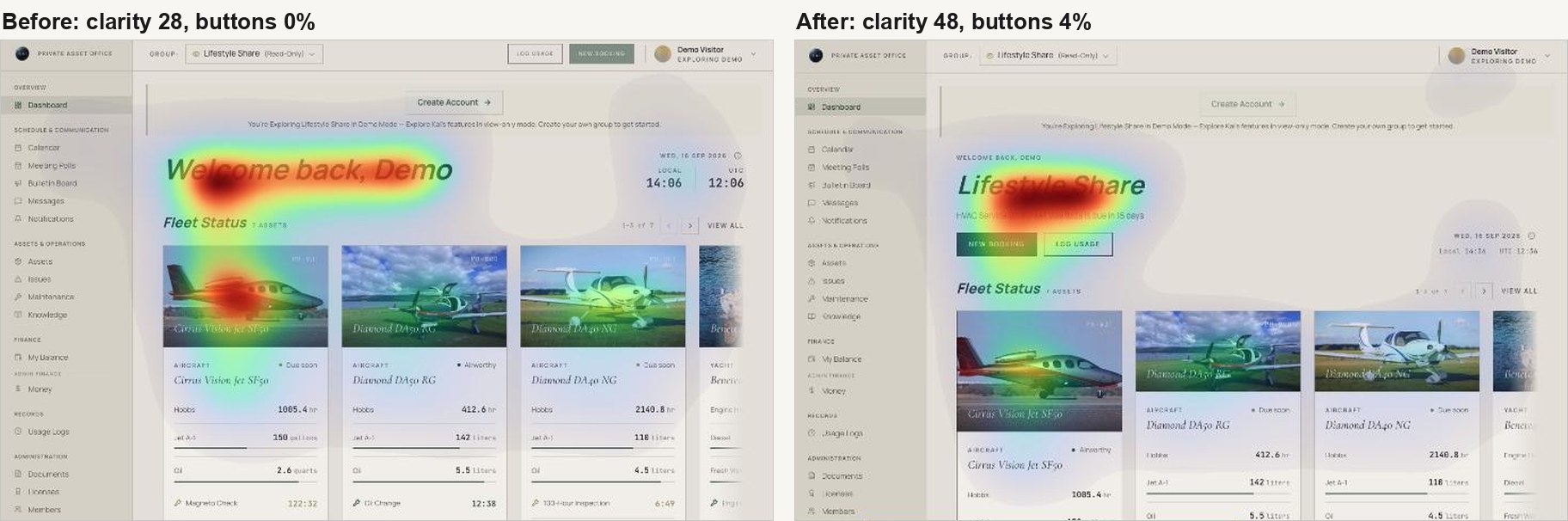
None of this was visible to us. We had looked at these screens hundreds of times, and to us they looked like Kai.
What we changed
On the dashboard, the greeting became a small line above the group name, which is now the title. Under it, one line says the next thing that needs doing: the most urgent maintenance item, or the next booking. The two action buttons moved out of the top bar to sit directly under that line. The clocks became one small row, and the first aircraft card got a taller photo so one card reads as primary.
The landing page took two rounds. The first grouped the button tightly with the headline, made it bigger and darker, and muted the photographs. That moved the score from 8 to 11, which is to say it barely moved. The aircraft were still the first thing the model predicted a visitor would look at.
The second round did what Brainsight's deeper analysis pointed to: the problem was distance and quantity, not saturation. The screenshot moved next to the text column and was cropped to a single row of aircraft. A short line, "No sign-up. Opens instantly.", now leads from the subhead into a button that spans the full width of the text. That took the score from 11 to 55.
The numbers
| Screen | Before | After |
|---|---|---|
| Landing hero, desktop, clarity | 8 | 55 |
| Attention on the demo button | 4% | 7% |
| Attention on the product screenshot | 37% | 24% |
| Dashboard, desktop, clarity | 28 | 48 |
| Attention on the action buttons | 0% | 4% |
| Hottest element on the phone dashboard | the clock | the booking button |
One thing we learned about reading these scores: the composite can go down while the page gets better. The mobile dashboard scored 49 before and 12 after, and the after is the better page, because attention now splits between the group name and the booking button instead of sitting on a clock. The areas of interest and the gaze path tell you more than the single number. All three rounds fit in one working day.
Why we are telling you this
Kai is a small team building for a demanding audience, and we would rather show our work than claim we got it right the first time. We did not; the page we were proudest of scored 8. What we can promise is that we measure, we change, and we measure again.
The changes are live on kai-sharing.com and in the demo group. If you are a fractional owner and something on the page still does not land in three seconds, tell us. We will put it through the model.